'Applefied Ads.' What If Every Advert Was Designed By Apple?
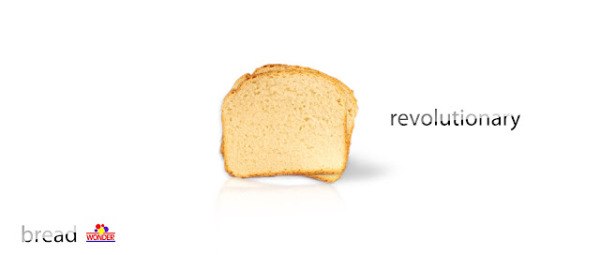
The white background. The use of myriad pro font. The boring minimalist layout. All of it is pretty synonymous with Apple; but what would it look like if this style was adapted to an ad for Coca-Cola, Levis or even bread? Think no more, as we introduce Art Director Bryan Evans' blog 'Applefied Ads.'
Seeing this advertising motif adapted to everyday products makes you realise a couple things. You grasp an understanding of just how outdated the whole 'minimalism' idea in this space is, and you take heed of just how pretentious Apple has been with their promotional material.
Take a glimpse at the nightmare world of every ad looked like an Apple ad.

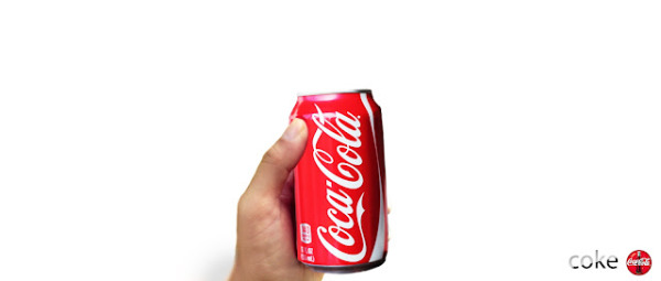


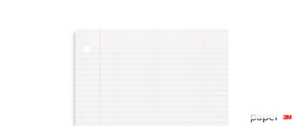

It's almost like peering behind the reality distortion field and exposing the advertising secret of Apple. Well I'm certainly not going to fall for it again...well i do really want some McDonalds now though.
Source: Applefied Ads
Jason England

